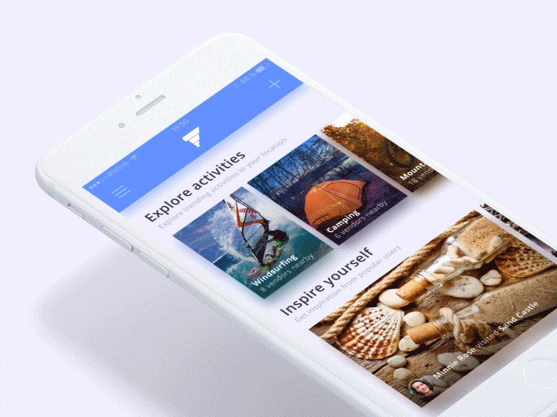
Mobile First, Desktop Later

Mobile First, Desktop Later
With the smartphone now a ubiquitous bit of kit, how are organisations adapting their strategy around communications?
Well many are now considering a Mobile-First Design Strategy.
As the name suggests, a Mobile-First Design Strategy is when businesses or companies invest in creating the mobile version of their website first before moving onto the Desktop and Tablet form.
Why start with Mobiles?
As of 2022, statistical research has shown that the average person spends 3 hours and 15 minutes on their phone each day. And 1 out of every 5 smartphone users spends 4.5 hours or more.
This means that most people check their phones at least 58 times a day. Though they might not have any particular task or goal in mind when going through their phone, they still do.
Recents studies have shown that the act of picking up a phone has become a habit for many individuals and that half of all screen time sessions begin within 3 minutes of the last.

While these numbers are alarming, it does tell us one more thing. A lot of people spend lots of time on their mobile devices.
This is why, though challenging, many companies have opted to start developing their website or platforms’ mobile version first.
Mobiles are handy. They make information accessible almost anywhere and at least 91% of the world’s population has a smartphone.
Apart from that, since mobile devices have smaller screens and people tend to spend less time on any individual page they see on a site in its mobile version, content and overall designs are made so every area of a site is SEO-friendly.
As such, Mobile First Designs:
Appeal to a Majority of Users
Features Prioritised Content above else making it much easier to identify which topics or areas to highlight when creating the Desktop version of a website.
Tend to be less buggy since they use simpler code and even less of it.
Are created more Responsive (making for better UX) than Desktop Sites and
Have Faster Loading times
While these have all that we look for in website development and maybe even a little more, these benefits are also what makes creating a Mobile-First Design harder than the traditional route of Desktops first.

Keys to Making Mobile-First Designs
Even if it tends to use much simpler codes, Mobile Versions need to be created with space and creative constraints in mind. You need to be able to create an alluring, catchy design without crowding up your pages and diverting users from the purpose of your site.

In this case, it’s more important to prioritise page content first before the design itself. This includes the intuitive navigation of users.
The lesser space there is, the lesser there is to explore. You’d want your viewers to have a smooth and enjoyable navigation experience. To do this, Web designers often leverage navigation drawers (using Hamburger menus) to display secondary elements of a website. This makes it easier for users to find necessary information quickly.
Additionally, with limitations in space, it would be best to avoid disruptive pop-ups at all costs. Though it might be tolerable on a Desktop version, on mobile pop-ups do not only take up space but they can cover an entire page, taking over the screen completely.
In conclusion, the key to an excellent Mobile-First Design strategy is the hierarchy of information. It’s all about guiding users towards the information they need in the most organised yet aesthetic way possible.

Before you go!
Building an Aesthetic Mobile Design Website from scratch is not an easy job. Therefore, together we can build a website that attracts more traffic to your high profile mobile website.
If you didn’t already know that we create websites for our clients, then we haven’t been shouting enough about it. If we you want to take a look at some of the websites we’ve created, head on over to the ‘Our Work’ page.
If you’re already set on working with us send us an email using our ‘Contact Us’ page or drop us a line.