The Best Web Design Trends of Last Year
The Best Web Design Trends of Last Year
Technology continues to evolve every year, every month and every day. The websites that were once plain and simple, had not much consideration for user experience and navigation have changed drastically throughout time.
Along with these changes, waves of features and Web Design Trends have wormed their way into the web. While some go as easily as they came, some are more than likely here to stay.
So, that said, here are some of the Best Web Design Trends of 2022 that we believe not only made a lasting impact on Web Design but are probably going to stick around for much longer.
Dark/Night Mode
Eye health has become one of the major concerns of many netizens. While they gladly use their gadgets and surf the net, in the evenings, even with anti-radiation and blue light protection glasses, the best solution to dealing with the bright night light emitted by a screen is to simply dim it down.
However, websites have started incorporating dark modes into their platform making it much easier for users to enjoy going through their pages without the need to alter the settings of their screen.
With a dark mode option, users simply need to toggle between dark and light backgrounds.
Immersive 3D Elements
People like testing things out and experiencing them first hand before actually making a purchase. The problem with that is that it costs so much time and money to actually go to places and try them out.
3D technology has completely challenged and changed that.
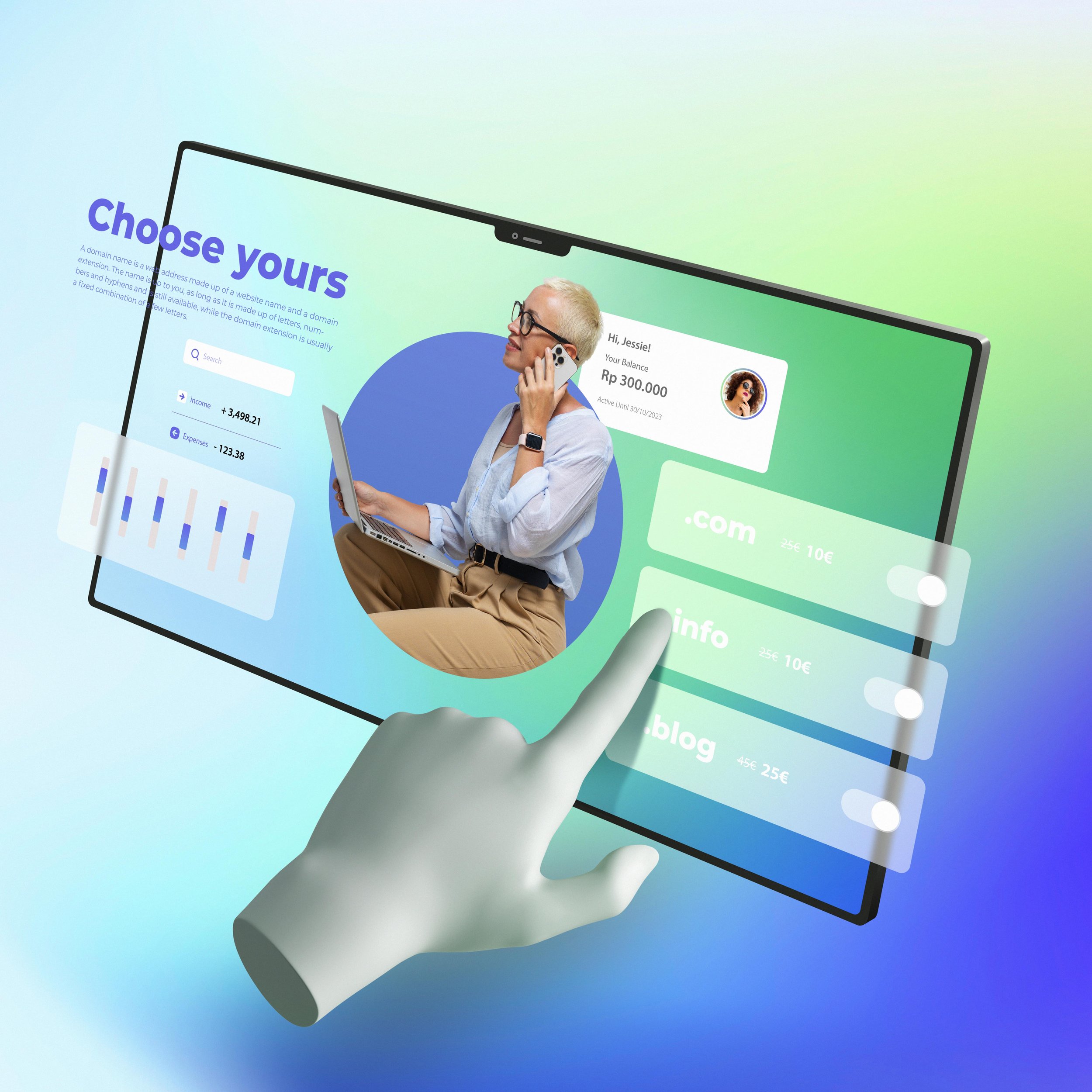
Now, users can immerse all their senses into an experience through hyper-realistic 3D features. By adding this, not only do websites improve their visual and aesthetic effect but they also encourage users to stay longer and even share their site to others as well.
Minimalism and White Spaces
We’ve gone from collecting and seeing more to wanting less and clean- especially now with the minimalist movement.
While the minimalism and white space trend doesn’t necessarily work for all, it’s worked great for tech websites and online marketplaces. People want to see less clutter while going through their favourite sites.
And while it’s best to utilise as much space as possible, white space isn’t something to be afraid of. Classic aesthetics will always be trendy - not just in 2022.
Photography and Graphics Collage
Visual experience is always the plus factor when it comes to website design. However, now people have turned to simply using a few images to creating a kaleidoscope of colour by mish-mashing photography and custom graphics.
This adds a special charm to photography, enhances imagery and improves the communication of different concepts in a very artistic yet aesthetic way.
Vivid Colour Schemes
Though there’s been a minimalistic trend that brands have been starting to be onboard with, the demand for bold, bright, vibrant and luminous colour is still on the rise. Even more so now.
This year, people are looking towards the future with optimistic eyes. As we’re nearing the future we could only envision in the early 2000s, the call for highly-saturated hues that create a futuristic colour scheme is all the rage this 2022.
Of course, it all boils down to what industry your business belongs to. But in the meantime, while you're down to explore it couldn’t hurt to see what bring and vibrant does to your website. You can even start off with a duotone web design that relies on neon colour against contrasting, stark backgrounds.
Before you go!
We’re always looking at trends in the industry, and we’re always looking for great clients to show them to.
If you’re looking for a marketing expert to help you create an engaging site drop us a line or send us or email to connect.


